Monday, June 1, 2015

Jun Fav


I remember as a kid how exciting it was when I'd get any kind of mail. There is one thing that actually gives me the same sense of genuine excitement. WOI is such a regular source of complete joy and inspiration it is the perfect fav for June.


My Favorite Things series appears monthly featuring totally random selected posts. Just a visual of something I love. ...and I'll likely say little or nothing about it as a thousand words should be enough.

Wednesday, May 13, 2015

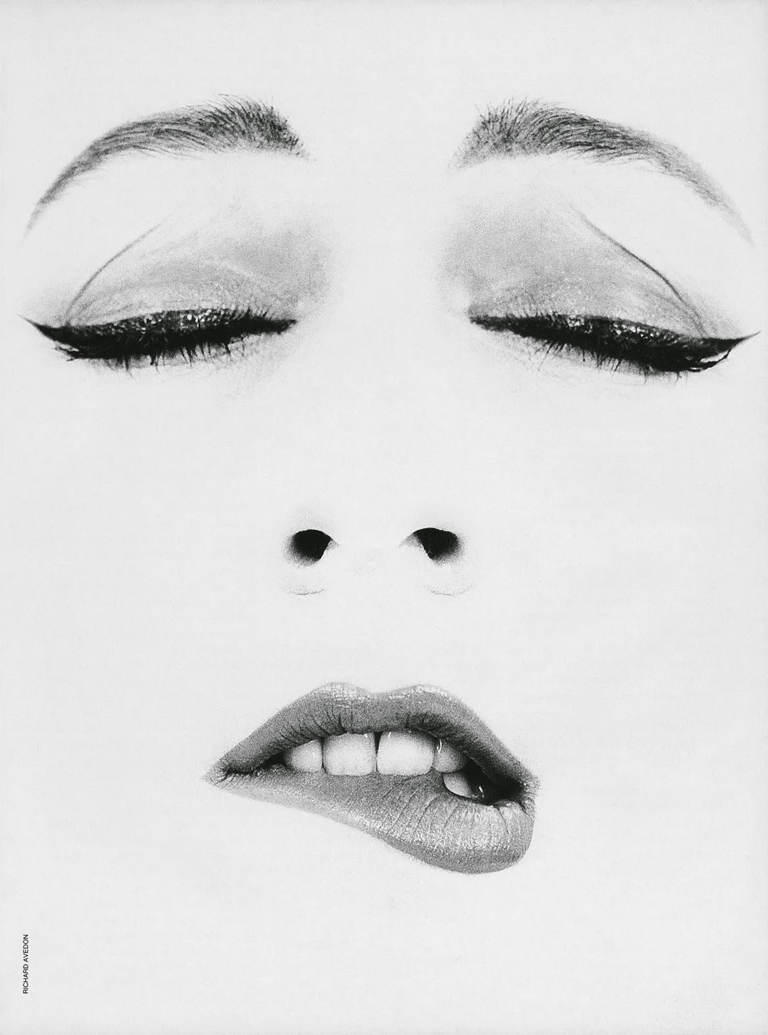
May Fav


Dovima and Avedon make me happy.


My Favorite Things series appears monthly featuring totally random selected posts. Just a visual of something I love. ...and I'll likely say little or nothing about it as a thousand words should be enough.


Cloud Thoughts


This is an image I created as a personal project that features my niece who generously (and somewhat reluctantly) posed for me.


Apr Fav

One part Harper's Bazaar, part pop graphic, perfect palette, two parts Pucci ...perfect.


My Favorite Things series appears monthly featuring totally random selected posts. Just a visual of something I love. ...and I'll likely say little or nothing about it as a thousand words should be enough.


Alexis


This is an outtake from a recent photo shoot. I'm partial to these shots when there's a clash of stillness and action. The breaking of the stillness is kinda exciting.

Monday, March 9, 2015

Mar Fav


This little brill building gem by Jeff Barry and Ellie Greenwich produced by Qunicy Jones and performed by Lesley Gore is a convergence of many favorite things. As a tribute to Ms Gore's recent passing I give this song the #1 position of my favorite things for the month of March.


My Favorite Things series appears monthly featuring totally random selected posts. Just a visual of something I love. ...and I'll likely say little or nothing about it as a thousand words should be enough.


Monday, February 2, 2015

Feb Fav


Rita Hayworth in Cover Girl 1944. Mesmerizing.


Friday, January 30, 2015

Tuesday, December 30, 2014

Fav-a-Month

Haven't been posting too much.

Happens, I've been working on things that I can't share publicly at this time. So in an effort to feel like there's some sort of flow going here... I will be posting one favorite thing every month.

Totally random. Just a visual of something I love. ...and I'll likely say little or nothing about it as a thousand words should be enough.


Monday, January 27, 2014

Rock, Paper, Scissors


I started photographing a collection of small objects to be blown-up into large scale framed prints. As I began to gather random objects that had some personal meaning, I realized there was a pattern to my choices.

Purely coincidence, seriously, I had a rock I pilfered from the coast of Martha's Vineyard, my grandmother's sewing scissors, and a collection of vintage calling cards. I'm not sure what but, I have a notion this must mean something.


Tuesday, January 7, 2014

Just a Moment


I've worked on a number of projects with Marc Friedland Couture Communications and most recently completed creation of advertisments for Marc's business. He is well known for high-end, over-the-top invitations and event designs for celebrity clients.

Naturally, I wanted the ads to embody the scope of what they stand for and not just a pretty shot of paper invitations. I outlined the creative goals of the project:

Position: MFCC is not just selling invitations. MFCC is selling dreams. Moments of fun, anticipation, romance, and glamour.

Demonstrable Messages: The act of giving and receiving an invitation is a glamorous act. The right invitation embodies the essence of your event and, more importantly, you.

Before I had even started on concepts, Marc had selected the model. The model was Morganne, a very talented chanteuse (and also a Gemini) with a unique style of her own. Her vintage persona had the right glamorous tone and lead me to working in one of my favorite genres, high fashion 50's.

The amazing photographer, Lara Porzak, and I both gravitated toward Lillian Bassman (shown below) as inspiration for the photographic style.


I then created about 6 different concepts that would work with all the various creative choices and limitations. Shown above are a few of my concept pages for the "special delivery" bird idea including inspiration and sketches. It was this concept that I had hoped would be chosen but initially wasn't so well received.

Marc decided that he wanted to stick with two headlines that he had used previously, "Make Your Marc" and/or "Marc the Moment". This narrowed the concept choices down. The Envelope Kiss concept (final ad shown bottom) fit with the headline, was well received, and as the primary choice, we focused the photo shoot around it.

Lara shot with film (which is now a rarity) and only using natural light. Chasing natural light, it was a whirlwind shoot, for about half a day. After I got all the necessary shots for the "kiss" concept we quickly squeezed in shots for the other concepts including the bird idea.

The following week, with hundreds of amazing photographs from Lara, I started scanning, retouching and composing the final ad concept. I went ahead and created the bird concept shown at top, primarily for me, and shared it with Marc. He ended up loving it and it ran also.

The ads ran in C Magazine, Los Angeles Magazine, and Hollywood Reporter.

Thursday, October 25, 2012

Fab...ric

Occasionally, along with branding, product, and packaging projects, I work on interior design/decorating projects. I am currently working on redecorating two bedrooms for a client.

Most design work I do involves creation of something from nothing. Decorating, however, is often more of a curation process; combining disparate elements (some of which you have more or less visual control over) to create the final design. The fabric is one of the more important elements of a room design that is often the "jumping-off" point that will define the direction of a room.

Of course, there are many fabric designs available out there. However, if you are a graphic designer (as I am), the impulse to create your own prints for fabric is really hard to resist. Shown here is a print I designed for a boys room that was inspired by the work of painter Paul Klee.

Like all creative challenges, the excitment of a solution is usually in the combination of elements that may not be expected to go together. To show the flexibility of the print for more sophisticated applications, I've combined the new print's boldness with the more traditional romantic profile of an 18th century Louis XV fauteuil. I think the combo is rather chic.

Sunday, June 17, 2012

House in House


Shuffling through the archive, I came across this shot from an article in Veranda magazine a couple of years ago. Because I don't really have a "press page" or show promotional tear sheets of any kind, this seems the right venue to share the photo above. The featured room was designed by Charlotte Moss and in the center of the photograph is the potpourri box I designed for Argaria. You can see more on the series of boxes on the studio site.

Friday, May 18, 2012

H2Ohhh.

For a number of months we have been conducting an experiment based on the work of Dr. Masaru Emoto. Dr. Emoto discovered he could alter the molecular structure of water by means of exposing it to different kinds of music as well as with the mere act of labeling it with certain words. By applying certain emotionally charged words, a particular intent is applied to the water by those who label it and those who view it. His studies are related to the power of human thought. You can click his name above to read more about it. It is really quite amazing.

For someone in the world of product and packaging, such as myself, this has some monumental implications. I'm well aware of the power of good packaging but this takes it to another level entirely.

All that in mind, we started a much less scientific experiment here at home. Impossible to prove the results but, well... it can't hurt. We started filling bottles with drinking water and labeling them with attributes we could all use more of... Love, Health, Prosperity... and drink it everyday.

The shot above is of the "Health" bottle. It was sitting on the pantry counter and the way the sunlight was beaming through the window, illuminating the air bubbles in the water was kinda magical.

I feel healthier already.

Wednesday, May 16, 2012

Cologne


In the previous post "Branding Bath" I talked about redesigning the bath and body packaging for Agraria. Included in that adventure was a redesign of the cologne spray bottle. Shown here is my concept for the new bottle that features the spherical "bottle stopper" cap and octagonal crystal body. An etched gold metallic neck band cinches this slimmer more elegant sister to the bath bottle.

Friday, February 18, 2011

A Poster Post


I have had the wonderful opportunity to dip a toe into the world of the theatre. No, sadly, not to realize my childhood dream to sing or dance ...to everyone's relief. Instead, to exercise my chosen path of design. This opportunity was due to my incredibly talented friend and wordsmith Mark Campbell.

Coming off a recent Grammy Nomination for the recording of his opera Volpone, he is preparing to open a new comic opera, The Inspector, at Wolftrap this April. He asked if I would create the poster for the show and I believe I had agreed to do it before he finished the sentence.

The Inspector is based on Gogol's The Government Inspector. For the opera, the political satire was reset in in Mussolini's Sicily and as Mark clarified "dictatorship is ALWAYS a ripe situation for comedy!"

The story has a strong theme of questioned identity. Mark had something Magritte-like in mind for the design as well as some reference to themes of corruption and Italian nationalism.

I looked to European posters of the period as visual reference. They were such a key medium for propaganda/advertising (same thing, really) for this period that it seemed a good place to start. I illustrated the black suit and fedora to allude very gently to gangster style with it's late 20's silhouette. The refined and more reserved typography, the vest, tie, and white shirt make the figure a bit more of a gentleman or perhaps government official. The corruption theme is hopefully recognized by the lire lining/pocket square details. The focused red and green color palette ideally give it Italian flavor. In the final version the green, white, and red flag stripes in the background give this theme more patriotic power.

I developed about 5 design directions. It came down to the green background with red lire details (shown above) and the Italian flag background with lire in hat. The Italian flag version (shown below left) was ultimately chosen.

The last poster I designed for Mark was in '95 for the musical Splendora (shown below right). This was while I was part of Manville:Bakacs:Santana design firm in NY and is also on my website of work created before 2005 (yellow link and password on the right).

Thursday, November 4, 2010

Do-Gooding Good Cookies


My friend Jacqui Farina had been a board member and volunteer with Project Angel Food for some time. She called me about an idea she had to create a line of cookies for them and if I would design the brand/packaging for it.

In case you're not aware of Project Angel Food, they cook & deliver more than 13,000 meals a week to men, women and children affected by HIV/AIDS, cancer and other life threatening illnesses. They have their own kitchens here in LA where they create all these meals.

So, the idea of taking a charity bake sale concept to a "Newman's Own" type business model seemed like a total "no-brainer". Needless to say, I said yes.

I started with the understanding that the product line would be positioned as a more giftable gourmet market item vs a mass "chips-ahoy" snack product. Not only because of the price point and quality of the product but to speak to a generally more affluent and/or charitable consumer familiar with Project Angel Food.

With the sub-brand name "Project Angel Food Bakers" we all agreed on, I kept the logo design as close to the organizations branding as possible to ensure the highest brand recognition. The PAFB brand's visual differentiation would be in the execution of other elements.

When eating a cookie all you really care about is if it tastes good. I put together the idea of how much good each cookie sold could do with how good the cookie tastes and came up with "the do-gooding good cookie".

The playfulness of the name felt particularly right for communicating the overall mission of bringing a smile and well-being to people in need and absolve the cookie eater of any quilt for eating as much as they can.

Angel imagery is obviously important to the existing PAF brand. Showing the goodness of the cookie and visually tying it to the charity's brand became clear... make the cookie an angel. Adding the halo helped to focus the idea on "goodness" vs a cookie that just died and went to heaven (no matter how accurate that may be once you bite into one).

Keeping the palette softly bright and most elements white helped keep the mood happy as well as allow the blue logo and the cookie to stand out.

The Do-gooding Good Cookies premier this week, with 100 percent of the purchase price being donated directly back to support Project Angel Food's life-saving meal service in a partnership with Pavilions stores.


Please, check out Project Angel Food's site for more info or to volunteer at www.angelfood.org.

Monday, October 25, 2010

Exotic


Dayna Decker is probably best known for her wood wick candles. Her collections of home fragrance products are in high-end retail shops around the world. You can check out Daynadecker.com if you would like to know more.

This past spring and summer, I designed a variety of product packaging/branding and re-branding for Dayna. The products are in the same category as Agraria, shown on this blog, but the brand is very different as you can see. Dayna's brand style is more modern, clean, and restrained.

I designed the Exotic collection packaging featuring a matte black stock with high-gloss silhouetted floral photography to compliment the previous collections and celebrate the rich and moodier fragrances.

Branding Bath


Back in 2009, I had redesigned and overhauled Agraria San Francisco's bath line. They had various products in this category but each item seemed like an "add-on" with the logo slapped on as the cohesive branding. I'm the first to support proper exploitation of a brands logo, however the idea of "branding" is so much more. It's a point of view, an approach, a delicate infusion of shape, color, proportion to form identity.

The existing bottle (shown here, inset) was/is a nice squared shape. This bottle is the same bottle that Apothia uses in their bath line (shown). Apothia's bottle looks much better because there branding works well with the shape. The better quality cap helps a lot too. For Agraria, it's "ok" but not a perfect fit with its more classical personality. For a company with a traditional luxury position this was not good enough.

In redesigning Agraria's overall branding, I had focused on the concept of 8 core fragrances. This idea took the form of an octagon repeated in various forms... as a label shape or an element in a pattern. For the bath line, the octagon manifested as a tall bottle shape, short bottle and hand soap bar with slightly different yet cohesive forms.

Wednesday, February 17, 2010

An Eye on the Forest


I occasionally sit-down and create a "Portfolio Cheat-Sheet" as shown above. A single page of various cropped thumbnails of my design/illustration/product work that will usually accompany a resumé or go to a client for a quick visual reference.

I've never really been a designer that focused on one style or genre (perhaps supporting my abject obscurity), but find inspiration in variance. If you poke around this blog a bit, you'll see I have worked in a variety of industries that are seemingly quite disparate.

Because of the variety of projects, I find it a good exercise to thumbnail the work to gauge where I am leaning stylistically at a given moment. Work that has just been completed, mixed with the past helps me to see the "common threads" as well as where I may want to go next.

Cropping the images, aside from just arousing inquiry, helps to keep anyone from focusing too much on what the object is verses "reading" the visual "feel". In other words... something like not focusing on the trees, but to see the forest more clearly.

-rm

LinkWithin

Related Posts with Thumbnails